Since I got a new phone (Samsung Galaxy S5) and since it’s my first foray into full-time android use (I dumped my iPhone
for this one), I get to learn all about new apps! Sometimes this is exciting, sometimes not so much because I don’t want
to spend all my time learning the apps, you know? Any rate, one of them was enough of a paradigm shift that I thought
I’d write about it.
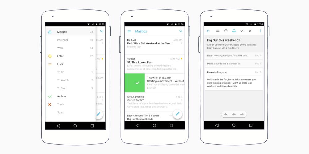
The app is simply called
“Mailbox” (www.mailboxapp.com) and, just like its name suggests, it is an email client. However,
there’s some additional functionality which intrigued me. Caveat up front, though: they’ve only got iOS, Android and
Mac OS clients; they don’t even have a web client. Therefore, if you’re constantly going between non-Mac computer and
a device with your email, this may not be the best for you.
First off, it only works with Gmail and with Apple mail. I use Gmail as a front-end to my email accounts, so we’re good
there.
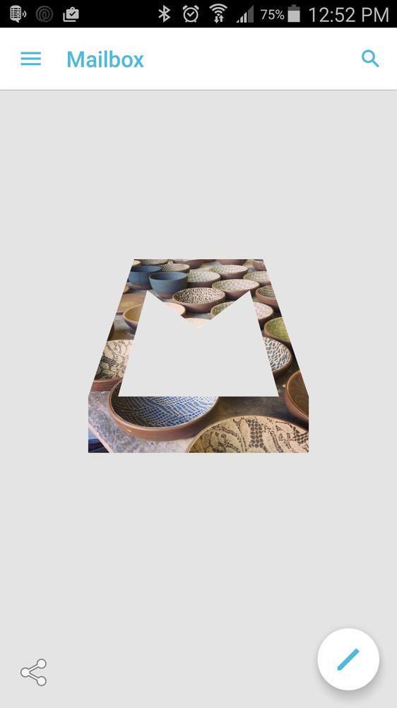
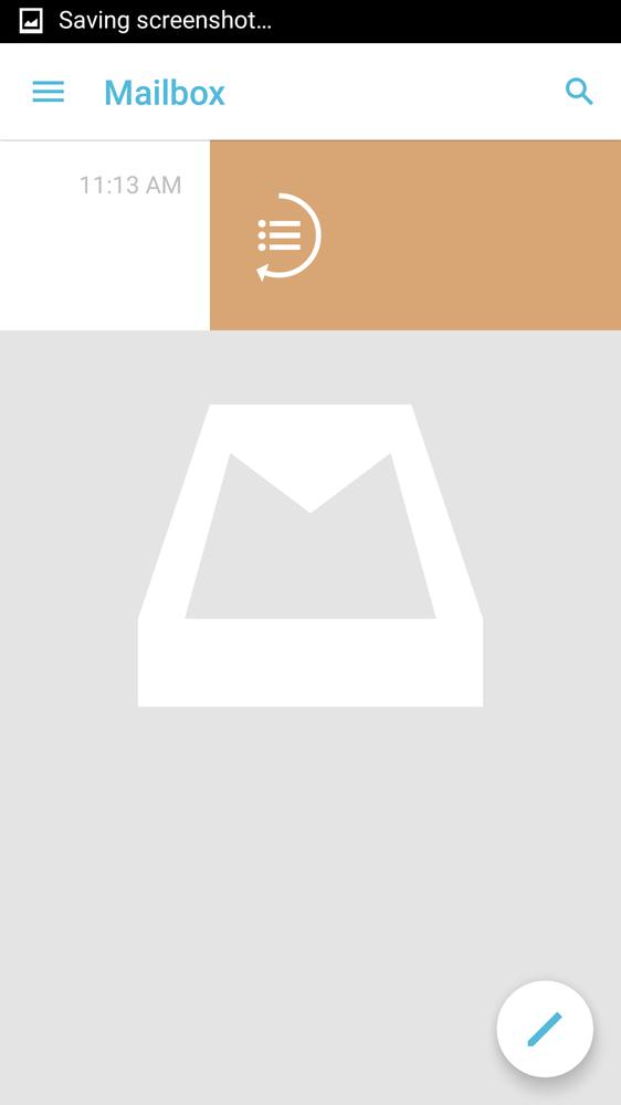
Second, Mailbox embraces the idea that getting to “inbox zero” (nothing in your email inbox) is a good thing as it can
reduce stress and clutter, and they want to make it as easy to do so as possible. When you get to no emails in your
inbox, the background changes to have a different daily picture, a little reward for getting to “inbox zero”. A sample
of this can be seen here:
Third, and this is the weird part, it takes the philosophy that email is just a glorified to-do list. This takes a
little faith and buying-in, and I’m not quite sure I’m fully there yet, but let me try to illustrate. Every email coming
in has an action attached to it. Many are just “delete” or “move to trash”: newsletters, advertisements from Think Geek,
etc. Some are things which are good information, but not right now. An example is my bank telling me there’s a new
statement ready. I don’t need this information on Tuesday afternoon, I need it when I’m doing the finances on Saturday.
Some emails are good information, but no action is really required; they’re more like a reference. These are things like
“your package has shipped”; you don’t need to do anything with this unless your package doesn’t arrive, in which case
having the tracking number is good. Then there are emails which you want/need to respond to more or less immediately.
Each of these cases is covered in a specific way with Mailbox, and it’s all done with swipes. Lemme ‘splain.
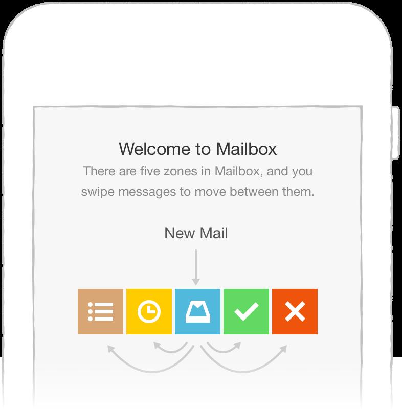
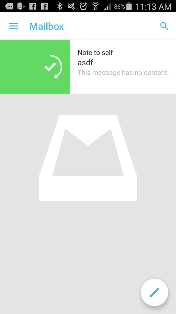
I’m looking at my home email screen, and I have a bunch of emails (well, one in the below screenshot, but imagine there
are more). Now, on each email, I can swipe it two directions: left and right. I can also swipe it short or long. That’s
four different swipes. Notice that there’s four types of emails above? Yup, you guessed it. Each type of email has its
own swipe which is associated with an action. Let’s see how this works.
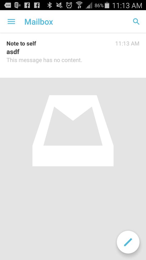
Archive
If I tap and swipe to the right, you can see the green box with a checkmark. This is to archive the mail. In the
parlance of “inbox is a to-do list”, this is the same as “done”; you don’t want to delete it, but any action required
has already been executed (or there was no action to begin with). If you need to find it later, searching will bring it
back (and the search is pretty darn good!)
Delete
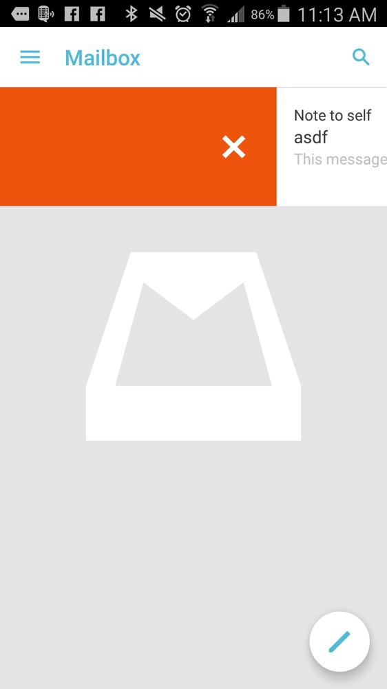
If I swipe even further (and you gotta swipe really far; it’s not accidental), then the box turns orange and an x appears.
This will delete them mail which does exactly what it says. I don’t think it deletes it right away; I think it’s just
queued for deletion later. This is when you’re done and don’t want to keep the email for any reason. I find that most
emails fall into this camp for me. Eventually :-)
Snooze
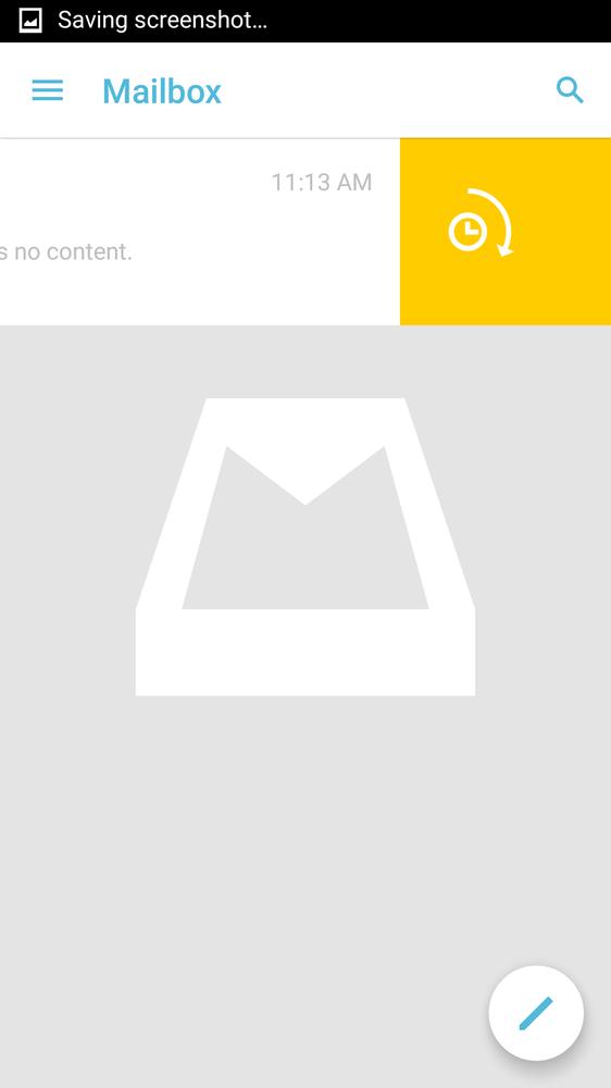
This is the thing that really got me curious about Mailbox. If you swipe a little to the left, you get a yellow box and
a clock; this will snooze your email until the time you choose. This is cool because, say I have a “your payment has
gone through” or “here’s your receipt” or “here’s an email with your tickets for that thing”, I can put it out of my
inbox and have them automagically come back at the time when it’s actually relevant.
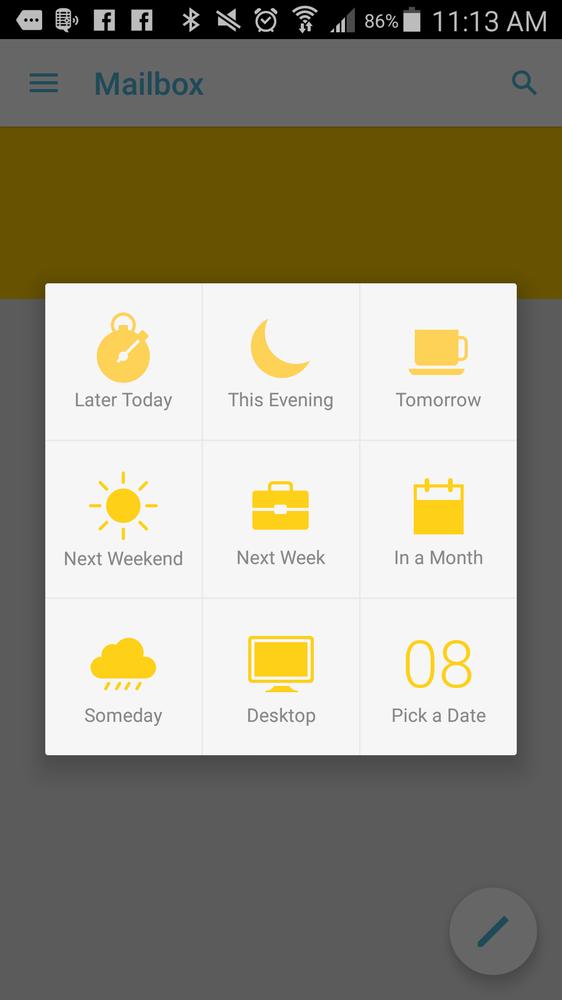
As you can see below, there are several different options to get the email right back in front of you. For instance, “Next
Weekend”; what does that mean? It’s actually configurable, so you can have those emails come back exactly when you want.
I’ve used it for my finances and receipts emails and it worked great; they all showed back up on Saturday at 10am.
Add to list
I’m the least clear about how useful this one will be, but I’m using it nonetheless. One thing which Mailbox removes is
the concept of folders or labels: grouping things which make sense together.
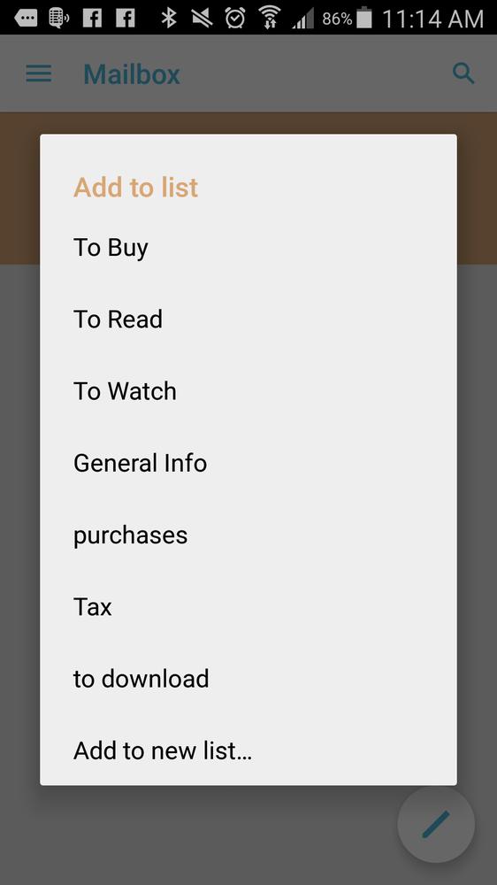
Mailbox ships with three default lists:
“To Buy”, “To Read”, and “To Watch”; this follows with the “to-do list” concept. However, I’ve been adding my own logical
groupings (as you can see, “Tax”, “purchases”, etc.), which I guess can be used as to-do lists. I suppose I could,
like, download the information and save it to my Dropbox (oooh, that reminds me… I’ll bring that up) or something, but
why go to that effort when I could leave it in my mail account?
That other thing
Yeah, so this also links to my Dropbox account so I can add an attachment from my Dropbox when composing a new email.
That’s pretty cool, especially if I’m using it primarily from my phone. That opens up a few possibilities for me. I’m
not sure that I can download attachments to my Dropbox, but I’m certainly going to investigate it.
Summary
Any rate, I’ve been using this for about a week and I think I like it. I’ll follow up in about a month to let you know
how it’s going!
Used the app? Sound interesting? Got something better? Let me know what you think in the comments!